3 Charts We’re Watching
December 3, 2015
This week, three charts particularly caught the attention of The Joseph Group’s investment committee as we discussed what is happening with markets and what is likely to happen going forward. We review each of these three charts below.
1. Seasonality is a reason to avoid getting too defensive. The chart below is a couple of weeks old, but its implications are still extremely valid. The chart looks at the second half trading pattern for the S&P 500 using data from the last 65 years. The pattern shows the S&P 500 tends to have its strongest gains during the months of November and December. Each year is its own year and this year certainly may not follow this pattern, but history shows it pays to be invested in the last two months of the year.
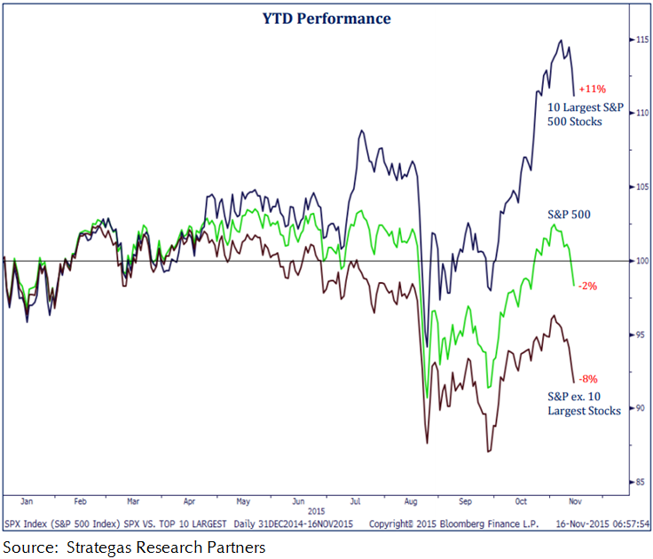
2. Performance in the S&P 500 this year is being driven by the 10 largest stocks. At the beginning of this week, the S&P 500 was essentially flat (when you include dividends) on a year-to-date basis. However, WITHIN the index itself, performance is anything but flat. The chart below shows that the 10 largest stocks in the S&P 500 (i.e.,Apple, Google, Microsoft, and Amazon) are collectively up 11% YTD. BUT, the other 490 stocks in the index are collectively DOWN -8%. Far more stocks are down than up so far in 2015 but due to the performance of a few big technology companies, the struggles of the stock market has a whole is not reflected in the major indexes.
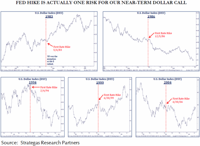
3. Could December’s expected Fed rate hike cause the dollar to fall? The U.S. dollar has been stronger recently which has negative implications for assets such as oil and gold which are priced in dollars and some foreign stocks whose returns must be converted to dollars for U.S. investors. Many experts think the Fed’s likely move to raise interest rates in December will put further upward pressure on the dollar as currency strength tends to move toward countries with higher real interest rates. However, in a case of “buy the rumor, sell the news,” history shows that Fed rate hikes typically result in a short-term DECLINE in the value of the dollar. The mix of charts below show what happened to the dollar when the Fed began to hike rates in 1983, 1986, 1994, 1999, and 2004. In all of these cases, whether the trend in the dollar was up or down, the immediate reaction was a decline in the dollar index. If history repeats itself, it could the result could be a surprise boost in the short term performance of international stocks and commodities before the end of the year.