A New Phase and A More Quick Hitters
May 8, 2020
To inform:
Coming into the office today was different. Being a financial firm, The Joseph Group is an “essential business” so we’ve had a few people in the office each day for the last eight weeks keeping socially distant from one another. The area around our downtown Columbus Arena District office has been largely empty and when I have parked in the six-floor parking garage down the street, I’ve been getting the very first spot on the first floor. Today, that was not the case – I actually had to loop around and go up to the second floor before I could find a parking spot. We’re entering into a new phase of the Great Lockdown where activity is starting to resume.
As attendees of our Portfolios at Your Place events know, we’ve been following a Road Map/Timeline with thoughts on what to expect for each phase of the crisis. We have passed the “Panic” phase which we believe ended on March 23rd (which so far has been the stock market bottom). We’ve recently been in the “Economic Impact” phase where the market has differentiated between “winners” (like technology and eCommerce) and “losers” like banks and energy companies. Now we believe we are entering the “Recovery” phase. Here in Ohio there are plans for salons and barber shops to reopen on May 15 and restaurants to reopen starting with outdoor dining on May 15 and interior dining on May 21. According to Ohio Lt. Governor Jon Husted, “once that happens, 92.5% of the state economy will have resumed business.”
So, with the theme of what The Joseph Group’s investment team is talking about as we enter this phase of “Recovery,” let’s look at a few quick hitters.
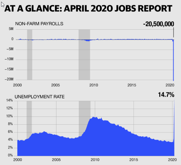
The April Jobs Report
Earlier today, the economic news was terrible. April non-farm payrolls were released and the U.S. economy lost over 20 million jobs and the unemployment rate jumped to an all-time record high (with data going back to 1948) of 14.7%.
Source: finance.yahoo.com
So, what is the stock market doing after the “worst monthly jobs report in history?” As I type, the Dow is up 357 points (about 1.5%) with small cap stocks up twice as much. It’s only one day, but it’s also interesting to look at what stocks are performing the best – retail stocks, energy stocks, tire companies, and regional banks are up more than technology and health care stocks. We think that’s important because one of the key questions on our “Road Map” under the Recovery phase is “Will leadership shift to laggards?” We’ve been seeing better performance from small caps and more cyclical stocks over recent weeks which is a positive sign and consistent with recovery.
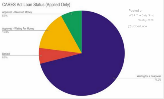
There Is Still a Lot of Stimulus Still Out There
The chart below looks at the status of small business loans applied for through the $2 trillion Coronavirus Aid, Relief, and Economic Security (CARES) Act. Only 8% of businesses who have applied for loans have received the money with 86% either waiting for the money or waiting for a response. That’s a lot of stimulus still to come.
Source: WSJ Daily Shot
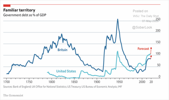
How Are We Going to Get Out of All of This Debt?
We wish we had the answer to that question, but we are comforted there is some historical analogue. While the dollar amount of the debt in the United States is eye popping ($25 trillion and climbing according to usdebtclock.org), as a percentage of economic output, the numbers take on more context. The chart below looks at government debt as a percentage of GDP (gross domestic product, or economic output) for both the U.S. and Britain going back to 1700. The chart shows the recent debt being racked up by the U.S. will take us back to levels last seen during World War II. In the words of Joseph Group Portfolio Manager Alex Durbin, “high debt levels are not a modern innovation.”
Source: The Economist
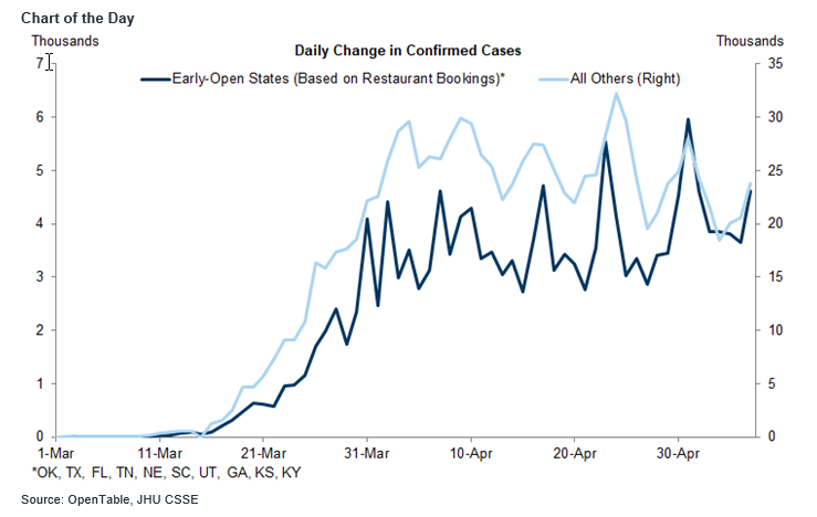
What About A Resurgence?
I think the biggest question and fear on most people’s minds is “what if we get a resurgence in the virus as we reopen?” We are asking that question constantly and are looking at data both in other countries and with “early open states” here in the U.S to try to have some sort of handle on it. The chart below looks at the daily change in confirmed coronavirus cases for early open states, which are defined as the 10 states with the largest increases in restaurant reservations (dark blue line) compared to the rest of the country (light blue line). So far, the lines look similar which implies we are NOT seeing cases grow faster in states which have started to reopen.
Source: Goldman Sachs Macro Economic Research
We’ll continue to share our thoughts with you as we enter this new phase of dealing with the virus. We deeply appreciate the continued trust of our clients as we work to help achieve your long-term goals. If you’re not a client, we appreciate your interest in what we’re sharing, and we’re happy to talk with you and answer your investment questions anytime. Life looks different now, but we’re glad to move into this new phase with you.