Bond Math Has Changed – And That’s a Good Thing
September 30, 2022
To Inform:
Stocks are retesting their June lows but one of the factors which has made the market environment particularly challenging is bonds are down as well. Most often, when stocks are down, bonds will tend to cushion the blow, but with the Bloomberg Aggregate Bond Index down over -14% YTD, bonds haven’t been a cushion at all. With both stocks and bonds declining, 2022 (so far) is the worst period for a balanced (60% stocks/40% bonds) portfolio with data going back to 1976.
The silver lining to the decline in bonds is the math going forward makes it extremely unlikely the next nine months for bonds will be like the last nine months. We believe “bond math” is much more favorable for investors than it was at the start of the year, and it has important implications for portfolio construction and future opportunities for investors. Let’s discuss.
First, A Bond Math Primer
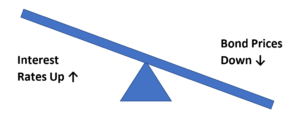
We like to visualize the relationship between interest rates and bond prices like two ends of a teeter-totter. When the first end, interest rates, goes up, the other end, bond prices, goes down.
Source: Travis Using Word Art
Why does this happen? If an investor is holding a bond paying 1.5% and wants to sell it, but interest rates in the market for brand new bonds is 4.0%, the investor is not going to be able to sell their bond for full price. The investor will have to accept a lower price…the price which makes buyers indifferent between a brand-new bond paying 4% and the older 1.5% bond which is now trading at a discount.
Source: Travis Using Word Art
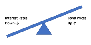
The opposite is true if interest rates go down. Continuing our example, if the rates on new bonds were to decline from 4% to 3%, investors would be willing to pay a premium for older 4% bonds, meaning their prices would rise.
Where Are We Today?
The interest rate for the benchmark 10-year Treasury bond started 2022 at 1.52% and earlier this week, the rate crossed 4.0% intraday. Here is what that looks like on a YTD chart:
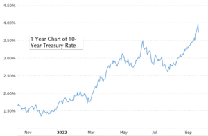
Source: Macrotrends.net
For further perspective, let’s look back a little further at a 10-year chart.
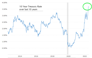
Source: Macrotrends.net
At close to 4%, the 10-year government bond is now paying the highest interest rate in over a decade!
The Starting Rate Matters for Bond Math
Today’s rate of close to 4% on the 10-year Treasury note has important implications for potential future returns. Let’s assume three potential paths for interest rates:
- If market interest rates move sideways, the bond investor’s return should approximate the starting rate or yield, which in this case is about 4%. With a starting yield at the highest level in over a decade, the potential income/yield from bonds is also close to its highest level in a decade.
- If market interest rates continue to move higher, the teeter-totter comes into play and bond prices would likely come down. However, the current yield provides a cushion against price declines…effectively making the teeter-totter move a bit less. With a starting yield at the highest levels in over a decade, the buffer against further price declines from bonds is also at its highest level in a decade. In other words, even if rates continued to rise today of the same level of magnitude they have earlier this year (e.g., from 4% to about 6.5%) bond returns would be less negative because of the higher buffer.
- If market interest rates move lower from here, the teeter-totter would come into play in the other direction and bonds would likely experience price appreciation in addition to the interest income the bond is paying. We believe this concept is important because interest rates have a historical tendency to decline in a recession. With a starting yield at the highest level in over a decade, potential price appreciation is significant if rates surprise investors and go back down.
A couple of weeks ago, JP Morgan put out a chart looking at the potential total return impact of a 1% rise or fall in interest rates. There is a lot on the chart but there are two key things I want to point out:
- There is a green box around the Bloomberg U.S. Aggregate Index which is the main index tracking the bond market. JPMorgan estimates a further 1% rise in interest rates would create a negative total return of -2.1%. That’s obviously not ideal but it illustrates bond math – because of the bigger buffer of today’s higher yield, the magnitude of the downward volatility in bond prices is unlikely to continue.
- Notice how the blue bars are so much bigger than the gray bars. Again, because of today’s higher yield buffer the upside/downside for an equivalent 1% move in interest rates is tilted toward the upside.
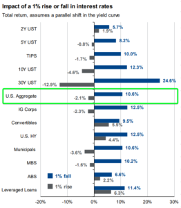
Source: JPMorgan Asset Management
Wrap Up/Portfolio Implications
If you have read this far, congratulations, you now have an advanced degree in bond math! You may be asking, what are the portfolio implications? The big one we have been talking about here at The Joseph Group is that interest rates historically decline in a recession. If the economy did fall into a recession and if rates did decline like they do historically, bonds are positioned to once again provide a cushion to the portfolio.
One More Unrelated Chart
At the risk of making this WealthNotes long, we wanted to include one more bonus chart. Long-time readers know one of the indicators we look at to track investor sentiment is the “Smart Money/Dumb Money” chart. The idea is to follow the so-called “smart money” commercial hedgers and insiders with longer time horizons but do the opposite of the so called “dumb money” emotional individual investors. When you see the behavior of the two groups move in opposite extremes, it can line up with important market turning points.
We’ve received the question a few times from clients, “What is the Smart Money/Dumb Money chart saying?” Today’s chart is below. It’s showing the “Smart Money” is reflecting optimism at an extreme level while the “Dumb Money” is reflecting pessimism at a historical extreme. With the caveat no one indicator is a perfect timing mechanism for the market, past opposite extremes have historically lined up with attractive intermediate/long-term buying opportunities for stocks.
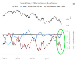
Source: Sentimentrader.com, Sundial Capital Research

Written by Travis Upton, Partner, CEO and Chief Investment Officer