Looking for Leadership in the Midst of the Market Correction
October 17, 2018
To Inform:
One of the theories we have after last week’s market correction is that we might see stock market leadership shift to a different group of stocks. So far this year in the U.S., “growth” stocks, particularly technology companies, have dominated “value” and dividend-paying stocks. Based on a number of metrics, the historical relationship between growth and value appears stretched and a “reversion to the average” would favor a shift to value and dividend paying stocks.
[Note: Our investment team has written a quite a bit on this relationship over the last few months – see links to past Wealthnotes below:]
https://josephgroup.com/growth-and-value-stocks-what-are-they/
https://josephgroup.com/is-leadership-changing-in-the-stock-market/
As we are writing this, we are only four trading days removed from last week’s headline-grabbing market decline, but we are actively looking for signs of a shift in leadership which may necessitate a change in portfolios. So far, it’s too early to make a definitive call. In last week’s big decline, growth stocks were the biggest losers, but in the big bounce that took place this week, they were also the biggest winners. Over the last month, value has held up better in a big picture context, but growth still leads the trends.
One of the reasons we are so interested in the growth/value relationship is the similarity to what happened after the last period of time the growth/value relationship was as stretched as it is now. Let’s show some pictures for context:
2018 Through 9/30 Chart: The chart below reflects the performance of the stock market broken up into “P/E Deciles.” That’s a fancy way of saying the market is broken up into 10 valuation groups – from cheapest to most expensive based on price to earnings ratios – and then the blue bars show the performance of each group. The fact that the blue bars are up the most on the right means more expensive stocks have outperformed cheaper stocks (based on P/E) so far this year. Those looking closely at the chart may ask what the yellow line is – that’s a 20 year average of this relationship and the yellow line being higher for cheaper stocks means what is happening now is a rare occurrence.
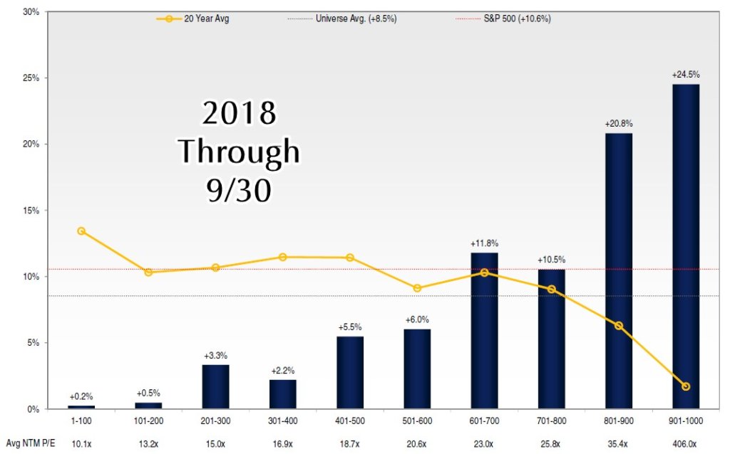 Source: Lyrical Asset Management
1999 Chart: We were able to get our hands on the charts for this relationship each year for the past 20 years and could only find one chart that looked similar – 1999. This was the peak of the technology bubble and represents the last time we could find more expensive stocks outperforming cheaper stocks to such a degree. To be fair, the magnitude of outperformance was bigger in 1999 than it is in 2008, but the similarities are striking.
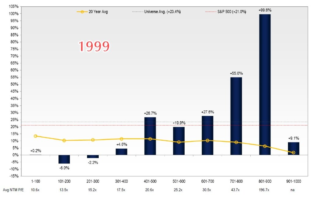 Source: Lyrical Asset Management
2000 Chart: To paraphrase Paul Harvey, since we are looking at history, we know “the rest of the story.” After the technology bubble burst, major market indexes had a major correction, but not all stocks were down. Cheaper “value” stocks held up better than pricier “growth” stocks and actually had positive returns in the midst of the decline.
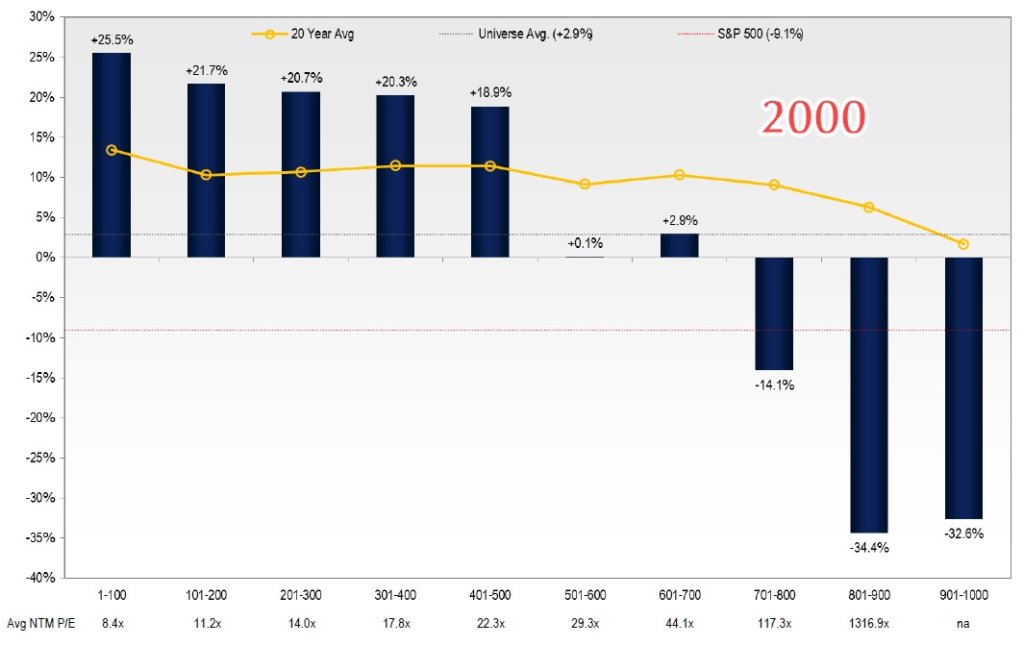 Source: Lyrical Asset Management
Mark Twain may or may not have said “history doesn’t repeat itself but it often rhymes,” but we like the quote and will use it here. We often get asked, “what are you doing in the midst of this correction?” We are doing a few things and one of the big ones is looking for definitive signs of a change in market leadership. We expect markets to be volatile ahead of the mid-term elections, so we aren’t getting too excited about the headlines, but we are looking for signs that support the conclusion that more “value” stocks in portfolios going forward could be a way to help investors achieve their goals.