Markets Tend to Care More About Better/Worse than Good/Bad
May 29, 2020
To Inform:
Recent conversations with clients have had a common theme – “how can the stock market be performing so well recently when the economic data is so bad?” We believe the answer lies in the idea that markets tend to respond more to “better or worse” than they do to “good or bad.” Even though the backward-looking economic data is “bad,” data concerning reopening and recovery has largely been “better.”
First, one of the major fears investors have is reopening the economy will lead to another surge in COVID-19 infections. Granted, it is early in the process, but so far there is no evidence of accelerating infections. This morning, BCA Research published the chart below showing the downward trend in the U.S. for both confirmed cases and fatalities from the virus, and they note two key points:
*Confirmed cases are a leading indicator for fatalities and confirmed cases are trending down even as testing for the virus is increasing.
*Data from the last week reflects a period when more states are reopening, but the reopening is not showing any signs of leading to more cases.
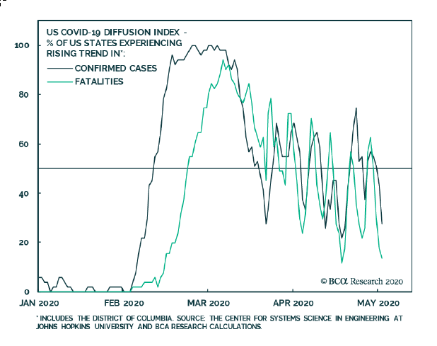
Source: BCA Research
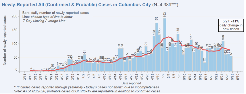
As I’m sitting here typing in Columbus, Ohio, here is a chart from the city regarding newly reported cases. Again, after about a week’s worth of restaurants, salons, and other businesses reopening, the trend in new cases is flat to down.
What about economic data? My parents live in Texas, a state where reopening has been happening a little longer than in Ohio and below are few charts from the Dallas Fed concerning services and retail activity.
Service businesses in Texas saw a bounce in revenue in the month of May, but perhaps even more importantly the future outlook (light blue line) has not only bounced, but has bounced to a level that reflects expansion.
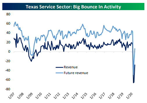
Source: Bespoke Investment Group
Retail businesses in Texas reflect an even bigger rebound. In the month of May, there was zero revenue decline with the future expectations bouncing back into normal territory. If anyone said to you, “retail activity in some states will be normal this summer” a few weeks ago, would you have believed them? Nonetheless, that’s what the data is showing.
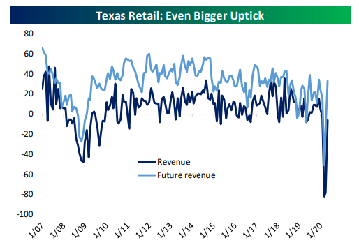
Source: Bespoke Investment Group
Finally, COVID-19 is a global pandemic – what about the rest of the world? As we’ve discussed in prior Portfolios at Your Place events, Italy is a country we have been following closely because they had a painful outbreak, but started to reopen about two weeks before the U.S. Below is a chart showing the change in confirmed cases in Italy. It is also worth noting the change in total active cases in Italy has been negative even as more of their economy reopens.
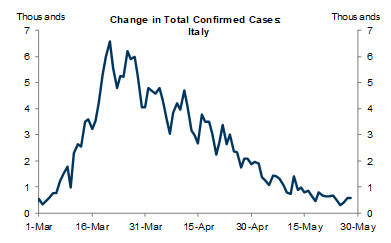
Source: Goldman Sachs Global Investment Research
We also have been getting a lot of questions about the “shape” of any recovery. Will it be “V-shaped,” “U-shaped,” “L-shaped or my personal favorite, the Nike swoosh shaped? Below is a chart showing consumer confidence in the U.S., Germany, the UK, and France. France is leading the bounce which is interesting, but what shape does it look like to you?
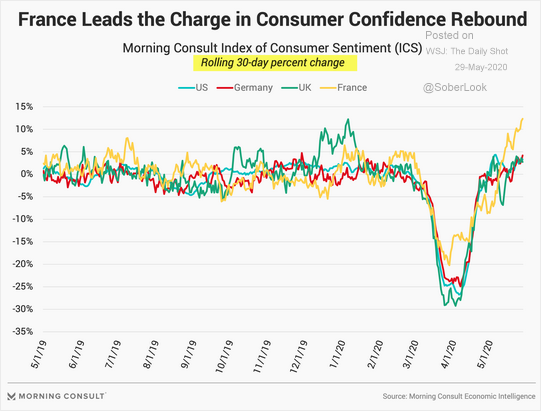
Source: WSJ Daily Shot
There is no doubt the human, economic, and emotional toll from the virus has been tremendous and recovery is going to be a process. Members of our team have had family and friends impacted by the virus and we do not take it lightly. When it comes to our job of applying logic rather than emotion to markets though, it is incredibly important to remember markets respond more to whether data is getting better or worse than if the data is good or bad. What has mattered most to markets is that even though recent economic data has been bad, as reopening becomes more widespread, the recovery is looking a little better.